Friday, March 19, 2010

SSRS – Format Multiple Columns

Often when designing reports you are required to apply the same formatting to multiple columns in one table or matrix. Since SSRS 2008 does not allow the developer to change the format of a column using Textbox Properties when multiple columns are selected, the developer must either:

· Change the formatting one column at a time

· Be familiar with the expression language.

Neither of the aforementioned choices are difficult, but maybe time constraints eliminates both as viable options. Therefore, I am going to share a quick tip that will help you format multiple columns quickly.

Let’s assume that you have a report that looks similar to this:

clip_image002

If the requirements were to change the formatting of each TotalDue column to Currency you can quickly change all of them by using the following steps:

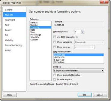
1. Using the Textbox Properties change the format to Currency for one of the TotalDue columns.

clip_image004

2. Once the format has been set, right-click on the column and choose Properties.

clip_image006

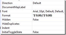
3. In the properties window locate the Format attribute and copy the value for that property.

4. Return to the table or matrix and select all the additional columns that require formatting.

5. Open the properties window again, ensuring that all the columns remain selected.

6. Paste the format value into the Format attribute.

7. Run your report and all the columns should be formatted.

clip_image008

Now all of your columns are quickly formatted. If you have another method to accomplish this please share it. If you have any questions or comments about this posting please email me at pleblanc@pragmaticworks.com.

Talk to you soon,

Patrick LeBlanc

Founder www.TSQLScripts.com and www.SQLLunch.com.

Visit www.BIDN.com, Bring Business Intelligence to your company.

Monday, March 1, 2010

Speaking at Charlotte, NC – SQL Saturday #33

If you are near Charlotte, NC, I will be speaking at their SQL Saturday on March 6th, 2010.  My session,SQL Server Compression 101, is at 1:30 PM.  This is the first SQL Saturday under PASS management.  If you have not registered for this event do so, seats are filling up quickly.  This is a free event where you can network and learn from some of the most talented SQL Server Professionals in the industry.

Talk to you soon,

Patrick LeBlanc

Founder www.TSQLScripts.com and www.SQLLunch.com.

Visit www.BIDN.com, Bring Business Intelligence to your company.
SSRS – KPIs without Analysis Services

During a recent project I was asked if it was possible to simulate Key Performance Indicator (KPI) images in SQL Server Reporting Services (SSRS) without Analysis Services. Off the top of my head I thought of a couple of things, but I decided to do a little searching before I embarked on my latest challenge. After one quick search I found a great video posted on SQL Share by SQL Server MVP, Jessica Moss, Designing a KPI in Reporting Services.

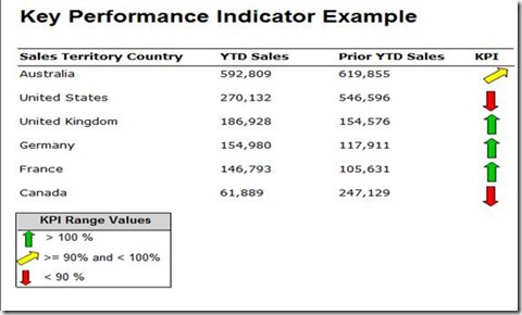
Using her example, with a few modifications I was able to produce exactly what the client needed. See the following screenshot for an example:

clip_image002

So how did I do it?

To start, I had a quick meeting with the client to determine the calculation for the GOAL of the KPI. It was simply a percentage based calculation between current YTD sales and the prior YTD sales ((CurrentYTD/PriorYTD)*100). The value indicators would be determined by the results of the calculations. As seen in the above screenshot, if the calculation was greater than 100 a green arrow should be shown, if it was greater than or equal to 90 and less than 100 a yellow arrow should be show and if the value was less than 90 a red arrow should be shown.

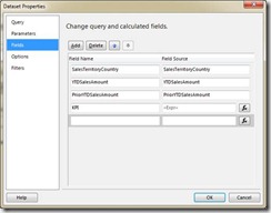
After all the requirements were gathered, the next step was to develop a method to dynamically show the arrows based on the KPI Range Values. First I created a calculated column that used the aforementioned calculation. To do this, add a calculated field to your existing dataset by right-clicking the dataset and select Add Calculated Field. The Dataset Properties window will appear:

clip_image004

Click the Add button and insert your calculation. You can also return the calculation as part of your result set and ignore this step.

Next add a column to an existing Table item on the report. Then add an Image into the column. See the right-most column in the following screenshot:

clip_image006

Next, right-click the image and select Image Properties and the following window will appear:

clip_image008

=SWITCH

(

Fields!KPI.Value > 100, "GreenUpArrow",

Fields!KPI.Value >= 90 AND Fields!KPI.Value < 100, "YellowAngleArrow",

Fields!KPI.Value < 90, "RedDownArrow"

)

Then click the expression button clip_image010 next to the Use this image drop down list. In the expression textbox enter the following or something similar to the following:

The SWITCH function will allow you to specify the image that should be displayed based on your KPI values. If you are not familiar with the SWITCH function read my blog posting, Reporting Services SWITCH Function , for more details. In the function I specify the image to display based on the calculated KPI Value.

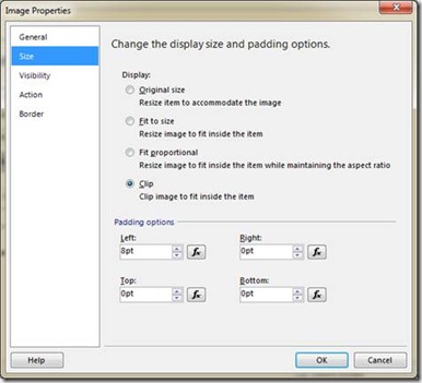
Next click on the Size in the right pane of the Image Properties box:

clip_image012

Ensure that the radio button labeled Clip is selected and you can also adjust the padding on the images just in case you want to change the alignment of the image. Click ok and run your report. You now have KPI type images in your Reporting Services report.

Downloads

KPIExample

AdventureWorks2008DW

As always, if you have any questions, comments or concerns regarding this posting please feel free to email me at pleblanc@pragmaticworks.com.

Talk to you soon,

Patrick LeBlanc

Founder www.TSQLScripts.com and www.SQLLunch.com.

Visit www.BIDN.com, Bring Business Intelligence to your company.