So, I was recently asked if you could display a vertical bar on a line graph to denote the last day of the month. Initially, I had no clue how to solve this problem. I talked to a couple of people and searched the web, but came up empty. I decided to just dive into a report and solve the problem on my own. So I started with the following query that can be run in the AdventureWorks2008 database:
SELECT st.CountryRegionCode,
CAST(sod.OrderDate AS DATE),
SUM(sod.TotalDue) TotalDue, NULL MarkerFROM Sales.SalesOrderHeader sodINNER JOIN Sales.SalesTerritory st
ON sod.TerritoryID = st.TerritoryIDWHEREsod.OrderDate BETWEEN '4/28/2003' AND '5/03/2003' AND
st.CountryRegionCode NOT IN ('US', 'CA')
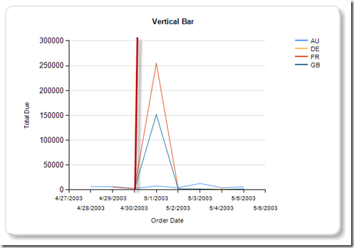
Note that there is a column labeled Marker that currently has a value of NULL. It will be explained later in this post. This query was the basis for this Line Graph:
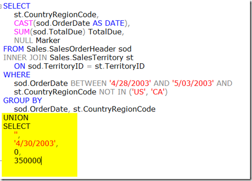
The RED vertical line you see in the graph is just an edit of the image, but this is the expected result. I have to admit my solution to this problem is somewhat of a hack, but I think it will work. The first thing i did was append a UNION to the query that would add an additional row which would be used to help create the vertical bar on the line graph. Since the initial query included four columns the UNION had to include four columns. The only two columns that required values are the OrderDate and the Marker. In this example, I hard-coded the OrderDate to the last day in April. You can modify it so that it is a parameter that is selected by the end-user. The second is a value or marker that will be used to determine the height of the vertical line. Slight modifications can be made to query to ensure that the value is consistent with the results of the query. For example, you could select the max from the result and increase it a little to further enhance the visualization. In this case, since I know the maximum is 300,000, I set it to 350,000.
What does the Union accomplish? This is done to ensure that the Marker value is visible or placed only on the last day of the month. I know what you are thinking, this is not going to work. That is what I thought. To create the vertical line I completed the following steps:
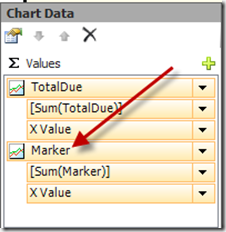
1. Added the Marker to the Values section of the Report
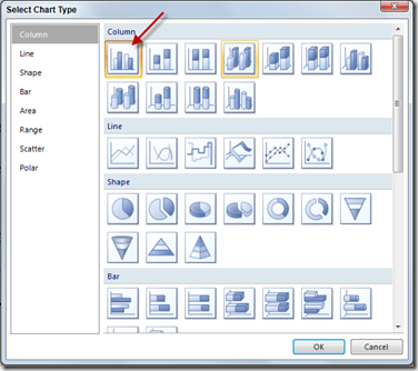
2. Next right-click the Marker value and selected Change Chart Type. Choose the first column Graph from the column section.
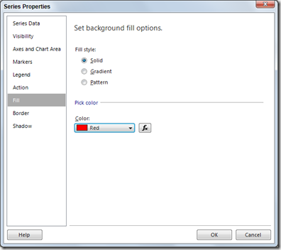
3. Now right-click on the bars on the graph and selected Series Properties. Choose Fill from the navigation pane and choose Red from the Pick color section.
4. With the bars selected on the graph open the properties windows. Then expand the Custom Attributes property. Finally change the PointWidth value to .2. This changes the sizes of the bar.
Now run the report. Your report should resemble the following:
You will see a single vertical bar whose point on the x axis is the last date of April and whose value is 350,000. This line is a bar graph that has been customized to resemble a vertical line. I am not saying that this is a perfect solution, but it appears to work. If you have any other ideas or methods that may solve this problem please post your comments here. Also, feel free to email me at pleblanc@pragmaticworks.com.
There are several ways to accomplish this, but this solutions does work. Stay tuned for Puzzle #6.
Talk to you soon,
Patrick LeBlanc, SQL Server MVP, MCTS
Founder www.TSQLScripts.com and www.SQLLunch.com.
Visit www.BIDN.com, Bring Business Intelligence to your company.


No comments:
Post a Comment